Creating a Renderer

In this guide, you'll learn how to build an autocomplete UI using React.

The @francoischalifour/autocomplete-core package provides all the primitives to build an autocomplete experience, but you remain in charge of the UI output. This page will teach you how to leverage all the autocomplete capacities to build an accessible autocomplete, both for desktop and mobile.

You can find the final result in this sandbox.

Importing the package

We'll import createAutocomplete from the core package and getAlgoliaHits from the Algolia preset which is a utility function to retrieve suggestions from an Algolia index.

import algoliasearch from 'algoliasearch/lite';
import { createAutocomplete } from '@francoischalifour/autocomplete-core';
import { getAlgoliaHits } from '@francoischalifour/autocomplete-preset-algolia';
// ...

Initializing Autocomplete

The Autocomplete entry point is the createAutocomplete function, which returns the methods to create the autocomplete experience.

const searchClient = algoliasearch(
'latency',
'6be0576ff61c053d5f9a3225e2a90f76'
);
function Autocomplete() {
// (1) Create a React state.
const [autocompleteState, setAutocompleteState] = React.useState({});
const autocomplete = React.useRef(
createAutocomplete({
onStateChange({ state }) {
// (2) Synchronize the Autocomplete state with the React state.
setAutocompleteState(state);
},
getSources() {
return [
// (3) Use an Algolia index source.
{
getInputValue: ({ suggestion }) => suggestion.query,
getSuggestions({ query }) {
return getAlgoliaHits({
searchClient,
queries: [
{
indexName: 'instant_search_demo_query_suggestions',
query,
params: {
hitsPerPage: 4,
},
},
],
});
},
},
];
},
})
).current;
// ...
}
  • (1) We leverage a React state for our component to re-render when the Autocomplete state changes.

  • (2) We listen to all Autocomplete state changes to synchronize them with the React state.

  • (3) We use an Algolia index as a source.

We now have access to all the methods to use in our React components in the autocomplete variable. We can start building the UI.

Using Prop Getters

Prop getters are methods that return props to use in your components. These props contain accessibility features, event handlers, etc. You do not have to know exactly what they're doing, since their responsibility is to create a complete experience without understanding the complex technical parts.

function Autocomplete() {
// ...
return (
<div {...autocomplete.getRootProps({})}>
<input {...autocomplete.getInputProps({})} />
<div {...autocomplete.getDropdownProps({})}>
{autocompleteState.isOpen &&
autocompleteState.suggestions.map((suggestion, index) => {
const { source, items } = suggestion;
return (
<section
key={`result-${index}`}
className="algolia-autocomplete-suggestions"
>
{items.length > 0 && (
<ul {...autocomplete.getMenuProps()}>
{items.map((item, index) => {
return (
<li
key={`item-${index}`}
className="algolia-autocomplete-suggestions-item"
{...autocomplete.getItemProps({
item,
source,
})}
>
{item.query}
</li>
);
})}
</ul>
)}
</section>
);
})}
</div>
</div>
);
}

The above code demonstrates that you do not need to worry about keyboard events, or tracking which item is highlighted, Autocomplete handles it with its prop getters.

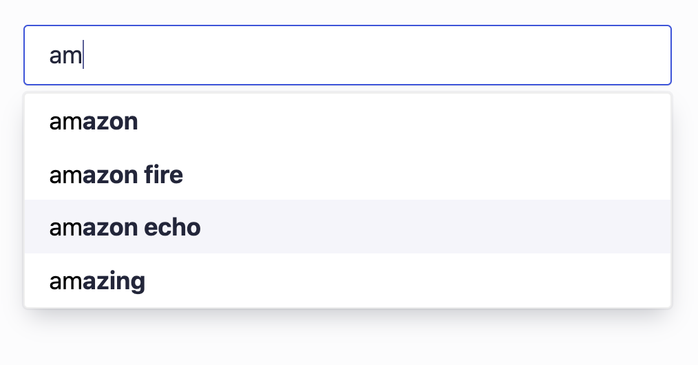
At this point, you should already have a usable autocomplete input:

Image

Improving the input accessibility

To improve the input control, we can wrap it in a form and apply the form props given by Autocomplete:

function Autocomplete() {
// ...
const inputRef = React.useRef(null);
return (
<div {...autocomplete.getRootProps({})}>
<form
action=""
role="search"
noValidate
className="algolia-autocomplete-form"
{...autocomplete.getFormProps({ inputElement: inputRef.current })}
>
<input ref={inputRef} {...autocomplete.getInputProps({})} />
</form>
{/* ... */}
</div>
);
}

getFormProps will handle submit and reset events and will respectively blur and focus the input when these events happen. You need to pass the inputElement to getFormProps to leverage this functionality.

You can add a label that represents the input:

function Autocomplete() {
// ...
const inputRef = React.useRef(null);
return (
<div {...autocomplete.getRootProps({})}>
<form
action=""
role="search"
noValidate
className="algolia-autocomplete-form"
{...autocomplete.getFormProps({ inputElement: inputRef.current })}
>
<label {...autocomplete.getLabelProps({})}>Search items</label>
<input ref={inputRef} {...autocomplete.getInputProps({})} />
</form>
{/* ... */}
</div>
);
}

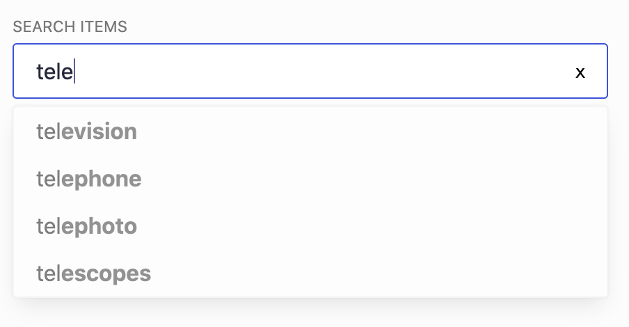
A good practice for search inputs is to display a reset button. You can conditionally display it based on if there's a query, and trigger the onReset event from getFormProps on it.

function Autocomplete() {
// ...
const { onSubmit, onReset } = autocomplete.getFormProps({
inputElement: inputRef.current,
});
return (
<div {...autocomplete.getRootProps({})}>
<form
action=""
role="search"
noValidate
className="algolia-autocomplete-form"
onSubmit={onSubmit}
onReset={onReset}
>
<label {...autocomplete.getLabelProps({})}>Search items</label>
<input ref={inputRef} {...autocomplete.getInputProps({})} />
<button type="reset" onClick={onReset}>
x
</button>
</form>
{/* ... */}
</div>
);
}

Reacting to the network

You can display UI hints when the network is unstable, which can help users understand why results are not updating in real time.

function Autocomplete() {
// ...
return (
<div {...autocomplete.getRootProps({})}>
{/* ... */}
{autocompleteState.isOpen && (
<div
className={[
'autocomplete-dropdown',
autocompleteState.status === 'stalled' &&
'autocomplete-dropdown--stalled',
]
.filter(Boolean)
.join(' ')}
{...autocomplete.getDropdownProps({})}
>
{/* ... */}
</div>
)}
{/* ... */}
</div>
);
}

You could for example create a .autocomplete-dropdown--stalled CSS class that lowers the opacity to hint users that the search is currently stuck.

Image

You can learn more about what's available in the state.

Enabling a native mobile experience

Native platforms offer better primitive for mobile search experiences than the web. Autocomplete aims at providing this extra layer for the web mobile experience to be as close as the native mobile experience.

A common feature in mobile native experiences is to close the virtual keyboard when the user starts scrolling. This makes the results more discoverable, without the user having to manually close the keyboard

The getEnvironmentProps method returns event handlers that let you create this experience.

function Autocomplete() {
// ...
const inputRef = React.useRef(null);
const searchBoxRef = React.useRef(null);
const dropdownRef = React.useRef(null);
const { getEnvironmentProps } = autocomplete;
React.useEffect(() => {
if (!(searchBoxRef.current && dropdownRef.current && inputRef.current)) {
return;
}
const { onTouchStart, onTouchMove } = getEnvironmentProps({
searchBoxElement: searchBoxRef.current,
dropdownElement: dropdownRef.current,
inputElement: inputRef.current,
});
window.addEventListener('touchstart', onTouchStart);
window.addEventListener('touchmove', onTouchMove);
return () => {
window.removeEventListener('touchstart', onTouchStart);
window.removeEventListener('touchmove', onTouchMove);
};
}, [getEnvironmentProps, searchBoxRef, dropdownRef, inputRef]);
return (
<div {...autocomplete.getRootProps({})}>
<form
ref={searchBoxRef}
action=""
role="search"
noValidate
className="algolia-autocomplete-form"
onSubmit={onSubmit}
onReset={onReset}
>
{/* ... */}
</form>
{autocompleteState.isOpen && (
<div
ref={dropdownRef}
className={[
'autocomplete-dropdown',
autocompleteState.status === 'stalled' &&
'autocomplete-dropdown--stalled',
]
.filter(Boolean)
.join(' ')}
{...autocomplete.getDropdownProps({})}
>
{/* ... */}
</div>
)}
</div>
);
}

Users will now feel a little bit closer to what they're used to on mobile apps.


You now have enough knowledge to build your own experience based on Autocomplete. If you feel like some topics weren't covered in this page, feel free to open an issue.